Wednesday, 23 November 2011

Erik Knudsen ... & ... Jill Cole

Erik Knudsen ...
Erik Knudsen is Professor of Film Practice at the University of Salford in Manchester, UK, where he is currently the Head of The School of Media Music and Performance. He regularly conducts guest workshops at international film schools, such as the Escuela Internacional de Cine y Television in Cuba, where he was Head of Editing between 2001 and 2009.He was born in Ghana to a Danish father and Ghanaian mother in 1956. He grew up, and was primarily educated, in Denmark, with a few years of schooling in Britain. After a stint of Law studies at Århus University in Denmark, he then went on to study film production at York University in Toronto, Canada, from where he graduated with a Bachelor of Fine Arts with Specialist Honours in Film Production in 1983. He returned to Britain in 1984, where he has lived and worked since. He gained his PhD from the University of Salford, 2002. 

In 2009 Erik made the short documentary set in Cuba, Vainilla Chip. This was during a break in the filming for his latest feature film, The Silent Accomplice, which was completed in early 2010. In 2008, he collaborated with the renowned theatre company, Hourse & Bamboo Theatre Company, to make the visual moving image components of their touring show, Veil. 2006 proved another busy year in which he completed two films: the documentary,Heart of Gold, and his fiction feature film, Sea of Madness. His previous film, Brannigan’s March, was released in February 2004. Previously, the documentary film Bed of Flowers, was completed in February 2001. Signs of Life, a fiction feature film, was completed in June 1998. Reunion, was completed in 1995 to a commission by Channel Four Television. Before that, One Day Tafo, commissioned by the Danish National Film Board, shot on location in Denmark and Ghana, won the bronze award at the 1991 Houston International Film Festival and was subsequently invited to compete in the 1991 San Sebastian Film festival in Spain. This film was also broadcast by Channel Four Television.
Prior to these films, Erik scripted and directed more than half a dozen short films, including Stray Dogs Can't Find Their Way Home and The Chastity of Jenny. He has optioned a number of screenplays to other producers, such as On A Starry Night to Strawberry Vale Productions, London, and Whose Gambit to Brian Eastman at Carnival Films, London.

As well as working with film he has also produced some really nice series of imagery, my favorite series on which i saw when looking through his work was called ... Cuba Waiting, the photographs included in the series aren't perfect and out preformed out there just normal everyday images which have also been taken on a normal camera. This particular series of photographs have been produced into a book and also an exhibition. Below are a few images which i have taken from the artist which really caught my eye.


Even though the photographs are not very sharp they are still very meaningful and show what other people around the world have to go through and even though when times get hard they are still smiling and are happy with anything that they can get there hands onto. With the photograph on the bottom left hand side i love the colours which are within the image itself, it just shows how old and rusty everywhere is because the people of Cuba can not afford the money to fix it up but i just love the textures which are included with the colours and it's just a very simple image and the composition on the image is very simple because you have got the door which is in the center of the photograph which makes you look straight to the center and then your eyes focus out to the rest of the wall, the photograph really makes you think about what life must be like for them. 


Jill Cole ... 
Jill Cole is currently working within the national forest and she likes to create imagery which is to do with the changing land use and the conflict which is currently happening on the land. when she is out in the national forest there are certain words that are always popping up in her head which she thinks that the national forest is about; which are change ... time ... layers ... diversity ... multiplicity ... coexistence ... conflict ... catalyst ... incomplete ... embryonic. Jill Cole likes going into landscape photography and one if the book which she thinks really helps her is; Land Matters - Liz Wells. One of her main focuses that she likes to look at while in the national forest is the change and the conflict in the landscape which is what she is trying to show within her imagery. One of Jill Cole's main priorities is that she tries to say what she wants to say through her imagery without any writing involved within the imagery itself. 

The camera what she normally uses for her work was a film camera when she was developing her skills but now she is using a 5D mark two camera to expand on her skills even more and to she what different types of work she can create ... with her national forest work she has; at the moment got 1O images which she still reckons needs a few more little pieces adding to them ... the 1O images which she has at the moment she has simply created by selecting around 2 - 3 photographs and then simply layered them on top of each other and then turned the opacity done so that you can see the images together. She took a lot of thought into what images are going to look better together.

previous work ... 
With a lot of her previous work she has mainly built herself up around the subject ... Birds.
Birds, 2OO7 - 2OO8 ... 
created over eighteen months on british military land, this series shows birds captured for scientific and conservation research on a nature reserve within an army garrison in north yorkshire. As part of a national bird ringing programme birds are caught during flight in fine nets erected between poles. Trained ringers maintain high levels of welfare throughout the process capture, data collection, ringing and release. By allocating each with a unique number the birds are identified as individuals whilst contributing to a broader understanding of the movement and population changes of their species as a whole. The series is drawn from a larger body of work centered on military training land which has included winter landscapes of military firing ranges and portraits of young army recruits on paint balling exercise. Through this work by referencing the interrelationship between conflict, beauty and renewal, the aim has been to locate our own, distanced realities within an ongoing presence of war.

Below are a few of the photographs which have been included in that series ...


this collection of imagery really does freak me out because they look dead and that's not the type of photography which i prefer but when i read through her personal statement which i have shown above the photographs i slowly began to realize what her work is about. What i love about her work is the action which is involved in the work , i love the movement which is being shown within her imagery and even if they are not in focus i still really like the colours that are within the photograph and also it makes the  photographs look very abstract. Even though her imagery isn't very strong with focusing on the main subject but she makes her work look very artistic because of the colours and the movement of the subject and makes you really look deep into the photograph itself.     

invention of photography ...


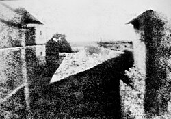
The first permanent photograph was an image produced in 1826 by the French inventor Joseph Nicéphore Niépce. The word photography derives from the Greek words phōs (genitive: phōtós) light, and gráphein, to write. The word was coined by Sir John Frederick William Herschel in 1839.


On a summer day in 1827, Joseph Nicephore Niepce made the first photographic image with a camera obscura. Prior to Niepce people just used the camera obscura for viewing or drawing purposes not for making photographs. Joseph Nicephore Niepce'sheliographs or sun prints as they were called were the prototype for the modern photograph, by letting light draw the picture.

Niepce placed an engraving onto a metal plate coated in bitumen, and then exposed it to light. The shadowy areas of the engraving blocked light, but the whiter areas permitted light to react with the chemicals on the plate. When Niepce placed the metal plate in a solvent, gradually an image, until then invisible, appeared. However, Niepce's photograph required eight hours of light exposure to create and after appearing would soon fade away.

The Birth of Modern Photography

Louis Daguerre was the inventor of the first practical process of photography. In 1829, he formed a partnership with Joseph Nicephore Niepce to improve the process Niepce had developed.
In 1839 after several years of experimentation and Niepce's death, Daguerre developed a more convenient and effective method of photography, naming it after himself - the daguerreotype.
Daguerre's process 'fixed' the images onto a sheet of silver-plated copper. He polished the silver and coated it in iodine, creating a surface that was sensitive to light. Then, he put the plate in a camera and exposed it for a few minutes. After the image was painted by light, Daguerre bathed the plate in a solution of silver chloride. This process created a lasting image, one that would not change if exposed to light.
In 1839, Daguerre and Niepce's son sold the rights for the daguerreotype to the French government and published a booklet describing the process. The daguerreotype gained popularity quickly; by 1850, there were over seventy daguerreotype studios in New York City alone.

Christmas card ...

...our task today was to simply create a Christmas card ^.^
Below is my final photograph to go on the front of my Christmas card ...
to create this photograph, it was originally two separate photographs which then i cropped to make them two long landscapes to them place them together. i then selected the center of the photograph with a circle outline and then tipped that upside down to give the photograph more depth and to also make the viewer have to look closer to see how the photograph has been developed because it looks kinda abstract and it kind of looks like a jigsaw in some way. i then added a crumple effect to make it look like it was an old used Christmas card and to also give it some depth. and then finally i added a definition of what i think Christmas is all about. 
i really like the effect which i have created within this photograph and i am also very proud of the work which i have produced for this little task for the day.    

personal c.v. ...

Curriculum Vitae

Charnee Smith
Trentside farm
11a Bargate lane
Willington
Derby
DE65 6BY
Tel: 01283 702426
Mob: 07527 658524

Date of birth: 18/07/1992

--------------------------------------------------------
 within every career that I have been in, I have had very good time keeping & organization skills. I am good with working as part as a team with other employees. I give a least 100% at everything I do & I am a very enthusiastic & positive person who is always smiling & willing to work.
Even though I like working as part as a team, I also like to encounter many tasks on my own. I am also a trustworthy & reliable person.
--------------------------------------------------------
Education & qualifications

2003-2008 John Port School

GCSEs
Grades
Geography
D
Food Technology
C
Maths
C
Applied Science
D
Science
D
English Literature
C
Art & Design
C
English
C
Information & communication technology
D
German
D
 -------------------------------------------------------
Current Education
I am just about to take a course which is BTEC Extended Diploma
In Photography and digital imaging which I am in my second year, at the moment I do 2 ½ days a week towards my course.
--------------------------------------------------------
Other courses attended
«  Level 2 award in food safety & catering
«  Sports leadership UK level 1 award in sports leadership
«  NVQ level 1 hospitality and catering
«  NVQ level 2 food and drink service
«  NVQ  level 2 professional cookery
«  Level 2 key skill in communication
«  Level 2 key skill in information and communication technology
--------------------------------------------------------
Interests
Some of my interests include socializing with friends and photography which is my biggest passion and biggest interest.
--------------------------------------------------------
Past employment
«  Next one day summer sales temp
«  The dial - commis chef
«  The seven wells - waitress - current
--------------------------------------------------------
Availability
I am available to work weekday nights but at the moment Im working weekends at my current job and I am available for an interview at any time.
--------------------------------------------------------
References
Mr S.Tomlinson
John Port School
Main Street
Etwall
Derby
DE65 6LU
Trina Simpson
Burton College
Lichfield street
Burton upon Trent
Staffordshire
DE14 3RL


still life ...

definition...
... Still life photography is the depiction of inanimate subject matter, most typically a small grouping of objects. Still life photography, more so than other types of photography, such as landscape or portraiture, gives the photographer more leeway in the arrangement of design elements within a composition...
... Still life photography is a demanding art, one in which the photographers are expected to be able to form their work with a refined sense of lighting, coupled with compositional skills. The still life photographer makes pictures rather than takes them. Knowing where to look for propping and surfaces also is a required skill...
the task in hand ... 
... our task was to create a still life photograph based on the subject on food which means there was lots of different things that we could do to achieve this task and a lot of things to consider ... here is my attempt on creating a still life photograph ...

Stuart rowen : food photographer ... 

... Stuart Rowen work is simply just beautiful just because if the detail that is in his still life photography ... he simply works on just trying to capture the essence of beautiful looking food ... here are a few photographs which captured me because of in intricate detail (shown above ) ... 

... what i really like about these two images is because if the way they have been put together and because of the way it has been presented to me, the viewer ... the amount of attention to detail in these two photographs are just amazing ... these two dishes look like they are meant to be from a top restaurant which they maybe but i just love the different colors which have been presented to me and also the texture in meat for example or maybe the chocolate which has been painted onto the plate using just a ordinary paint brush ... 
... what i love about the photograph on the right is on how close up he has gotten to the object itself so you can see how much detail the photograph holds and you can also see the different colors within the object which makes you look closer into the photograph and makes the viewer look closer into the photograph ... the same with the photograph on the left had side really ... the one thing that fascinated me was the bubbles or foam which was just lying on the fish so gently which really added a nice seaside feel to the photograph ... all of Stuart Rowens work is very clean and crisp which is what you need when it comes to still life food photography and i think he is extremely good with what work he can produce to show the reader's ... 
comparing work ...
with the work that i produced with this task i know that mine is more different compared to the other still life photographs that you are more likely to get based on food but i wanted to do something different and to try something that i had never done again ... with Stuart Rowen's work his is more serious because of the way it has been put together because the image is a lot sharper and a lot crisper whereas in my image it is very soft because of the lights and that what you want really when it comes down to light photography ... with Stuart's work he has really focused on what he wants for his final piece where as with me i wanted to experiment trying to do something different seeing as i did take the image on my camera phone and then also edited it on my phone too and i don't think the outcome is too bad but i do really like Stuart's work and you can see that it is for more of the commercial side where mine is for the funniest side of things ...   


write and fold up ...

the task in hand ... 
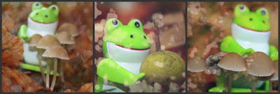
the task on which we had to do today was where we had to grab a piece of paper and pass it round where then other people will write down the following ... name of a colour ...  name of an object ... a random word ... the line from a lyric of there choice and also ... a number ... once you go the results back then you have to create an image or a series of images which would show of what you particular words off very well ... this is my final piece below ...
if you couldn't guess from looking at my montage on which i created then my words were ... name of a colour : green  ...  name of an object : mushroom ... a random word : frog ... the line from a lyric of there choice : here come the drums which was from voodoo child and also ... a number : 3 ... i think that the outcome of my montage is very well put together and thought out and a fun piece of work for everyone to look at ... 
when looking up on artists which create there own photo montages, i came across an artist called James Nader who's work really grasped my attention and made me look a lot closer into his work ...
James Nader ...
there was two particular pieces of work which he created which really  grasped me into the photographs to look more closely which was the photograph above and also the photograph below ... both photographs show there own unique stories and there's so many different views on which you could look at these photographs and what these photographs may have been created for ... for example the photograph above looks like it has been used in a music video because of the way it has been composed to keep your eyes moving and to discover new objects within the photograph, and it also keeps the mind going to create your own story up ... i love the way the montage is very strong in its own way because of the colors which have been used with the photograph and because also the intensity of the colors too ... with the montage below its in its own league of it own and i just love the way this has been composed all the same again because of the way it keeps you thinking about what is going on and because of the story it tells ... 
comparing work ... 
i know that between myselfs montage and James Nader's montage  there isn't a lot to compare against ... but i think it helps when you put yourselves work up against anothers because you can see the differences between the photographs and it gives you a few ideas on what you may like to become when you progress within this business over the coming years ...you can see what you can achieve when you boost up your confidence and also the skills which is really exciting because it makes you want to do well ...   

spot the difference ...

the task in hand ... 
the task which we have been set is to look up at a certain artist that really inspires you and to do some research on the type of photographs that they take and then go out and try and take an image which is similar to there's but with some differences which is why this task is called spot the difference ... the artist that i really adore has got to be miss Eleanor Hardwick, her work seriously inspires me which i think will be good on this task because i can build some skills up to make myself a better photographer ... 

Eleanor Hardwick ...

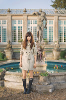
here is a few selection on the photographs which have been taken by the beautiful Eleanor Hardwick ... all of the photographs that i see which come this particular artists sends sooo many ideas running through my head which makes me want to experiment and try new things when it comes down to myself doing a photo shoot ... when i look at one of her pieces of work i can tell straight away who the artist is because shes got her own unique style when it comes to put the ideas into a photograph ... she has had sooo much experience which is why i think it is a good idea to have ago at this spot the difference with one of her pieces of work ... Born in Oxfordshire, England in 1993, Eleanor became interested in photography at the age of twelve when she began to take photos of collectible Japanese fashion dolls, leading the hobby to progress into a passion for portraiture and fashion. When researching for information on this wonderful photographer I noticed that she called most of her photographs dreamscapes, I also found an interview with the artist herself and one of the questions was … why do you enjoy photographing people so much and what inspired you to take portraiture photographs ?. Her answer to that question was “Ever since I was little I have loved to draw people, I never seemed to have much interest in sketching landscapes or still life. I guess I am very drawn by how versatile people are; everyone is different, and every photographic situation is something new and never been done before. I suppose a famous landmark, such as the Eiffel Tower, can only be photographed in so many ways, but a single person is constantly changing both physically and mentally.” I have found her very inspiring towards the work that I want to try and create.
With the particular photograph on the left, I love how very mystical it is because you can only see the outline of the model and then you can only see a light floatie dress which is just falling elegantly off the model. What I really love about the photograph is how you have got the balloons which look like there just floating around on their own and then you have the light shining through the balloons them self. What I really like about this photograph is how it resembles a circus. It’s just the way it looks like you have got a massive show light behind the model and then you’ve got the balloons which makes the photograph look very theatrical which is what I love about it. With this photograph there’s not just one thing you can look at it keeps your eyes busy and also makes your imagination go wild because it could resemble anything. I love how simple this photograph is she has thought the photograph out pretty well and kept all the colours so simple with the plain, white floatie dress and then the colourful balloons so it’s not too over powering on the eyes.What I love about this photograph on the right hand side is how magical and theatrical the photograph is because of the way it has been composed. With most of her photographs when you come it, it looks like they've come out of a fairy-tale children’s storybook which I love because of the imagination she has used with each photograph and what great deal of thought and imagination has gone into each photograph. What I love about this photograph is how simple it is because of the colours which have been used and because of the location on which it has been taken. Again like most of her photographs, this photograph is very old fashioned because of the soft and light, pastille colours which have been developed within the photograph.  Even though when you look at the photograph you can tell the butterflies have been edited in, it hasn't put the photograph at a great down fall because it’s still a beautiful and lovely piece of work yet again by the lovely Eleanor Hardwick. for this task i am going to try and re-create the photograph which is below ...
my final piece ...  
i am very pleased with my final image ... i know that i haven't gone for the most obvious way of trying to do it exactly as the artist but there has got to be some differences to compare between work ... 
comparing work ...
with both images they have been developed in colour even though they have both been developed with the different tones of colours for example with Eleanor's version the colours are very strong and also going down the way of being in the purples and blues where as in my interpretation the colours are very strong and i have also gone to stay with the natural colours within the photograph ... both images are individual photographs which stand strongly on there own because of they way they have been composed because there is a lot for the viewer to take in because there is sooo much going on ... both photographs been produced in the landscape form because it then shows a lot about the location of the photograph and they are also the same size and shape which means that they are easier to see and there just the right size ... to be honest in both images i know that mine has only been manipulated in the sense of the colours and the tones and also just made the image softer, whereas in Eleanor Hardwick's photograph it still only looks like it has been manipulated in the colours and i think that the photograph was that strong when in was taken so i can see that minimal manipulation has been done ...  both images are very similar obviously because of the task which has been set but they are both taken in a similar location setting and also the poses which the models are in are very similar ... in Eleanor's image i think that it's sending the message of Christmas where as in my image i don't think it shows any message what so ever obviously because i haven't got all the decorations in the trees and also the model is not wearing a paper hat ... in my image i have got my model to dress up in a evening party dress which i think goes really well because it's the clash of the nature against the city life which i think works really well ... and the same again with Eleanor's work i think with the image as a whole i think it works really well :)... 

Andy McKeown and the slipstream software ...

slipstream software ...
the slipstream project first saw the light of the day in 2OO3 and was initially based on videatag. a series of tools and code blocks developed in 1993 for tagging and interacting with video and audio streams and first used in a series of video based modern foreign language activities for oxford university press. a useful analogy in describing the slipstream engine is that of an old analogue radio tuner. where fragments of radio programs are heard as the dial is turned and the tuner skims across the channels. the channels are individual image collections and the user slides the interface across these collections pulling images to the screen as it moves to create a real time montage.
slipstream in constantly in a state of development and each outing is with a new build and accompanied by a growing number of editors and image processing tools. the latest generation of slipstream features a range of physical and sensor based wired and wireless interface controls. the image below is a fragment from the COAST tarlair collections from 2OO8.


Andy McKeown ... 
Andy McKeown was an artist which came into college to talk about his new software that he had created which was called slipstream. after looking through his collection on is own website. you can really begin to see that he has created so much work which are all different in there own way. the other collections that he has got on are ... prints, monoprints, drawings, slipstream and light. you can really tell that he is into so much different art and design as a contemporay artist.

the photographs just above really caught my eye when i was looking through his collections. these particular pieces were created at the Blackpool illuminations from 2OO8 - 2OO9 ... the event was called local heads. this collection was presented to the general public from the gueens promandae in 2OO8 and the to the north promenade in 2OO9. this particalur illumination features 312 pop art portraits from a submission of 864 images. the images submitted via project website and public photo sessions in Blackpool and Manchester. the final selection was by a random computer selection at the live event on Blackpool.
what i really love about this artist is how much effort he puts into every single piece of work and takes so much care. when i was looking through his gallery and his pieces of work ... one collection that really caught my eye was the drawings gallery.
 i love how the images are very abstract because you cant really tell on what they are and what they mean. i just love interesting they are and different and they really get you thinking on what they are meant to be and then you come up with your own story for them. with the image in the middle to me it looks like a lost sailor at sea with the glasses which look like they have got sad eyes in the side of them and you've got also got the boat on the  water and then the boats in the eyes which is why i think it has got something to do with the sea. i love how he's got some really strong colors in there which really stand out to the viewer and also there's some really strong contrasting colors in there because you've got the green turquoise blue water and then you have got the orange which i reckon it represents nightfall coming.
 

fantasy landscape ...

to do ...